The week after the mid presentation was a bit disturbed by a fantastic event held at the Institute of Design here in
Umeå. We, interaction design students worked together like crazy to organize the event and host our guests. More
about it here. Anyways, some work could be done before the event, and the presence of such important designers
was an opportunity for great feedback. [Thanks Jack!!]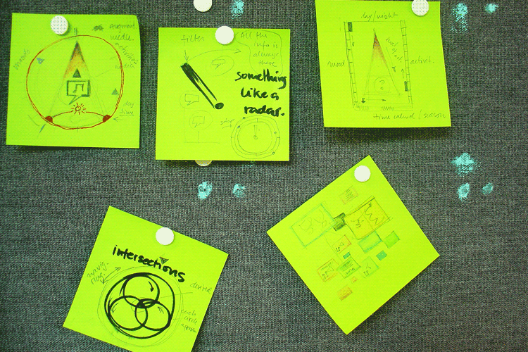
From the comments I got in the mid presentation I selected some of the ideas I had and decided to try them graphically,
developing the interface in some directions to make the final decision on which way to go. Previous discussions with
Mattias Andersson and my classmates had already pointed to a more fun and entertaining experience, but still I had to
give them a face and behaviors.
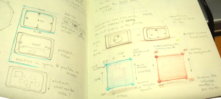
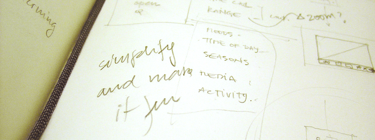
Some aspects that I started thinking: where is the best place to reference the user, in the center of the screen or in
the bottom? Iam considering how this will affect the perception of movement and the localization of experiences. Other
issues have been either to use full screen for the application or contain it into a shape, like I had in the prototype. Finally
I started sketching some key modes to the interface and then would work in the transitions. In the image you can see
these two squares in the lower right. [SU stands for Setup - where the users applies the filters :: AV stands for Active
Visualization - when the user will actively engage with the system giving it full attention :: MV stands for Minimized
Visualization - when the system is running but the user is not paying attention to it.]
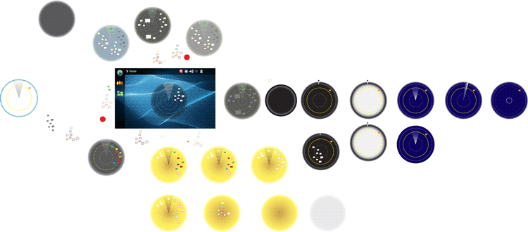
I started playing with the radar - like interface and the graphic problems didn't take long to appear: size of the experience icons,
how to visualize what is in them, how to call attention to them etc. I was also concerned here to make the interface in a
way that I could have the Setup and Active Mode as two faces of the same coin so to speak.
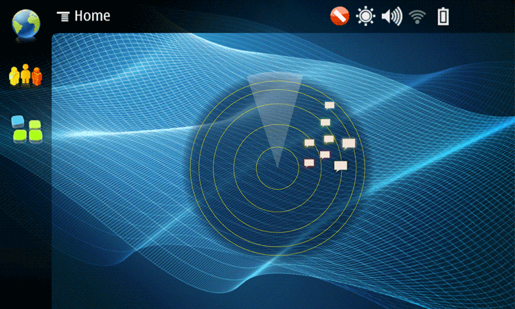

Looking closer at the "radar" interface in AV mode [on top] and setup [below].

So, after the Sensing and Sensuality event on Friday, I had a discussion with Jack Schulze about my project last Saturday.
His feedback was sharp and generous. "Mate, this is way too complicated." He showed me some other examples of
located media services and pointed out the virtues of their simplicity. The metaphor of the compass was appreciated, but
should it be so literal? How could I bring the experiences closer to the surface of the screen and not require the user to
dig for them so much?
Specially for the content I am dealing with, that I decided to call Contemplationable Knowledge, it's not essential that
the user gets the information on the experience, so I should bring it forward from the start. This feedback in a way
answered the question regarding the use of full screen or not. I have to use more space in order to show what's each
experience is about. Time to think it over.
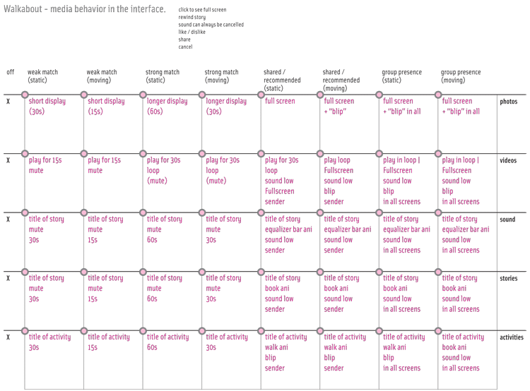
This matrix helped me think what should happen to each kind of media present in the experiences [rightmost column]
according to some parameters I defined to level of notification [top row]. From this point I took a break on the
interface per se and started structuring the system before, to find out which would be the variants and aspects
to be designed. By this time I had a name to the service: Walkabout and the knowledge that it sould happen in
the mobile device and have a website companion. So I started wireframing them both.
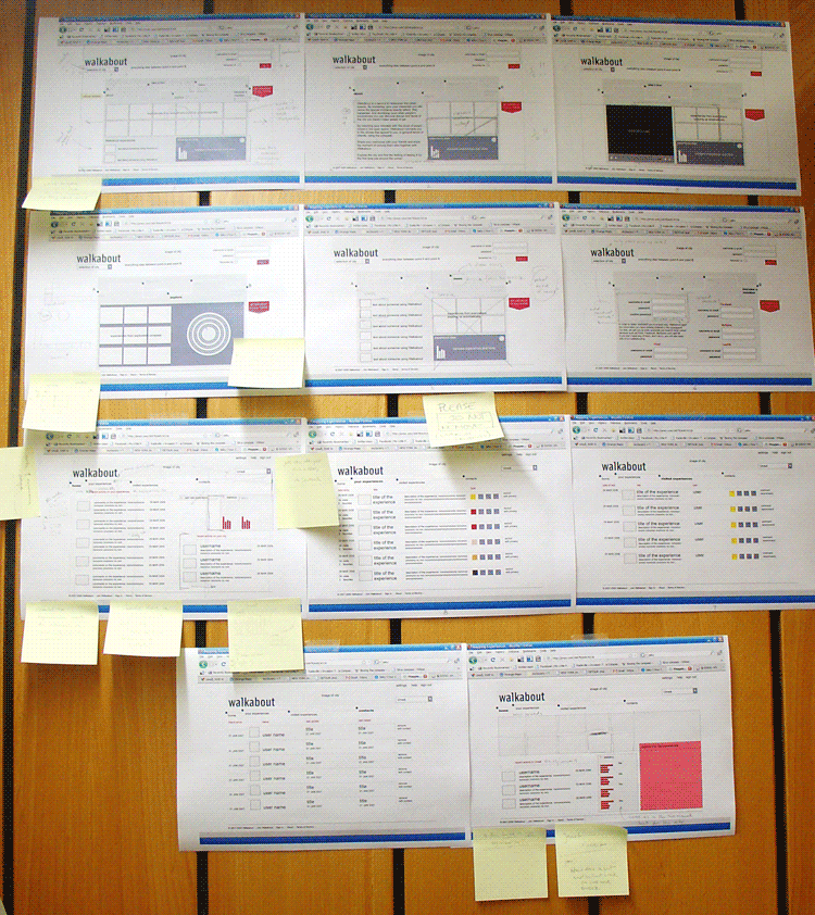
Walkabout companion website plan. Once I had the proto-screens on paper, it helped me think and evaluate the service
and what should and should not be developed in the scope of the degree project.
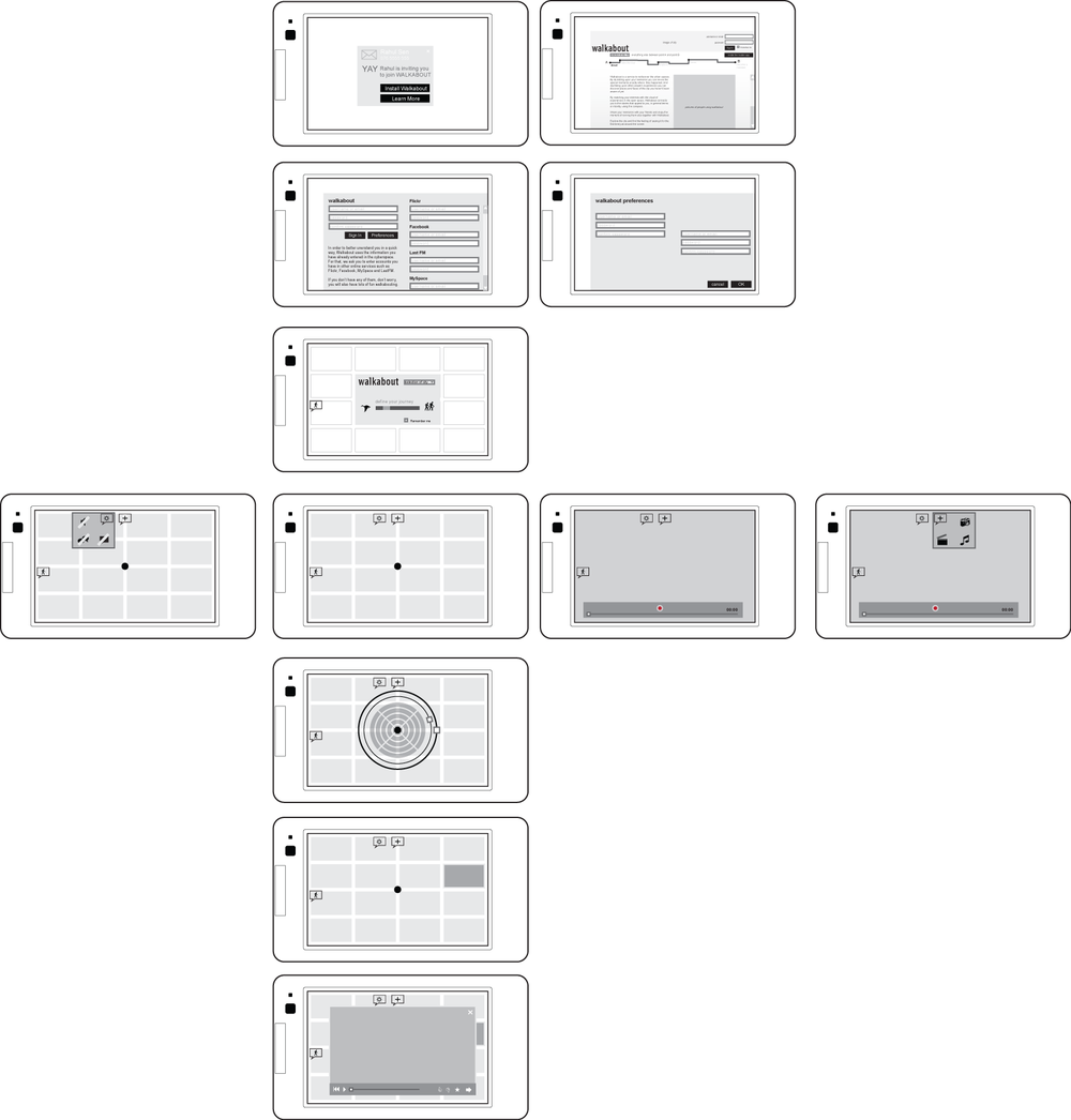
The Walkabout service is intended to happen in the mobile device, this is the focus of the project. However this was the
first time I was laying out in some details the whole process. Although I didn't concentrate at all in the graphic problems,
the interface here is already completely different from the radar-like one. I am now exploring the wallpaper as the container
of experiences that would be updated over time and of course according to location.
The main axis on the diagram represent the basic path from receiving an invitation to Walkabout to engaging with an
experience found. The lateral screens show alternative interactions. [Such as: from the invitation the user can either
install it (screen down) or learn more (screen to the right)].
With these wireframes at hand I had two very interesting discussions yesterday with Mattias and Rahul. The result was
that as a framework it is good, I can consider it done, but the interface must be developed and refined a lot. The grid as
it is breaks the sensuality of the content and as much functional as it is, doesn't convey the fun and serendipity that
I am defending in the service's concept. Time to redo it again.